

However, another problem is knowing how to find these websites. This post will overview just some of the free and readily available tools that
can be used to visualise climate change and weather statistics in an elegant
and engaging way.
Live Data Tools
Live Data Tools
Global Weather
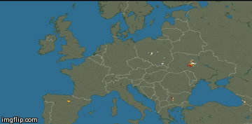
Perhaps the most powerful capability of the internet is the ability to view global data almost instantaneously. Probably the most beautiful example of this is the elegant website ‘Earth Wind Map’, an animated map of global weather conditions. Whilst the default settings are mesmerizing enough, the map is fully customisable. The map can be moved about and zoomed in, and click on 'earth' in the lower left corner to change the data options between air currents, temperatures, sea currents or sea surface temperatures, all available through different altitudes, projections and scales.
All this data processing means that the
map is relatively processor-intensive, so only GIF images are embedded
here as an example. Follow this link to use the tool for yourself.
 |
| Examples of the 'Earth Wind Map' website. The 2013 Polar Vortex system (left) & strong Atlantic winds (right). |
Lightning
Strikes
Believe it or not, a bolt of lightning strikes Earth 100 times every second (or 8.6 million times each day). What's more, you are now able to view the location of each strike live, anywhere on Earth. Each lightning strike emits a pulse of radio waves that travel at the speed of light for thousands of miles. This radiation is detected by an array of inexpensive antennas that are distributed globally by volunteers of the site Blitzortung.org.
When lightning strikes, each detector
sends the precise time of arrival to a central server, which is then able to
triangulate the position of the bolt. This is a relatively new project and is
run by volunteers, and as a result coverage is still largely restricted to
North America, Europe and Oceana.
Below is another GIF example of some lightning storms over Europe, but visit Blitzortung's website for the map with full capabilities and
customization.
Visualising Past Data
Instantaneous data is rarely useful for analysing climate change. Instead,
the challenge is in viewing decades of data within a single figure.
Simple Annotations
The traditional method is to use a simple graph showing a climatic
variable against time. We can now take this a step further and annotate any
interesting data points or outliers with more information. See this visualisation by NASA, for example, which tracks the average global temperature annually
since 1880. This is just one visualisation tool of many from NASA, a list of which can be seen here and all of which are worth a look at.
The Sound of Climate Change
Daniel Crawford, a University of Minnesota undergrad, created this
truly unique way of interpreting data when he took NASA’s Goddard Institute of
Space Studies surface temperature data and portrayed the rises and fall in
temperature as musical notes.
His method was to map the temperature range over 3 octaves, with
the coldest year on record (1909) set to the lowest note on the cello (open C).
Each ascending semitone represents about 0.03C of warming. In this composition,
each note represents a single year, from 1880 to 2012, and low notes represent
cold years and high notes signify warm years. The result is a haunting, original and thought-provoking way of representing anthropogenic climate change.
Interactive Infographics
Infographics, short for ‘Information Graphics’ are, by definition,
a method for presenting complex data quickly and clearly. Their main benefit is
in their user-controlled content; you’re often able to define the temporal and
spatial boundaries of the data you want to see.
A good example of this is ‘BreezeSystem.com’; an interactive
infographic showing the cumulative installed wind power capacity per country,
continent and world as a whole between 1981 and 2013. ClimateReach has already
touched on ‘The Rise of Renewables’, but this tool shows just how much
renewable energy has been embraced over the past few years.
To use, click play or drag the slider at the bottom to see how
wind capacity has changed over time. The area of the circle corresponds to installed capacity, and you
can hover over each circle for more information. Only countries with more than
50 MW of wind power capacity as of the end of 2013 are presented.
See the host website here for more information.
Other Useful Tools
World Under Water
An Infographic which gives a visual representation of how sea level rise will impact on coastlines. You can add an address to see how your town might look underwater.
An Infographic which gives a visual representation of how sea level rise will impact on coastlines. You can add an address to see how your town might look underwater.
GapMinder
A powerful graphing tool developed by statistician Hans Rosling. You’re able to define each axis and animate the datapoints to see how they change over time. In this link, the Y-axis is set to CO2 emissions per capita. Play around with X-axis variables and specify which countries to view (the default setting is to show them all), and then hit play to see variations since 1820.
Visualised Temperature Change
A simple graphic from NASA that uses a colour-coded heat map to show temperature change since 1880.
A simple graphic from NASA that uses a colour-coded heat map to show temperature change since 1880.
Climate Reanalyzer
An informative tool which shows how today’s weather information compares to long-term climate averages.
An informative tool which shows how today’s weather information compares to long-term climate averages.
YouTube Data Visualisation Series
A website listing a series of animations and videos of datasets, similar to the Visualised Temperature Change video above.
Summary
The internet is a powerful tool and offers more than many of us realise. With an almost unending list of documentaries, YouTube videos, podcasts and infographics, there is now more ways of learning about weather and climate than ever before.
If you know of any other website that should be listed here, note
them down in the comments.